The Importance of Mobile-First Website Design
If your website isn’t built for mobile, you’re already behind.
Most of your potential clients are checking you out from their phone — not their laptop.
So if your site doesn’t load fast, look good, or work well on a small screen… they bounce.
Why Mobile-First Matters (Right Now)
Take a second and think about your own behavior.
When’s the last time you visited a website on desktop first?
Exactly.
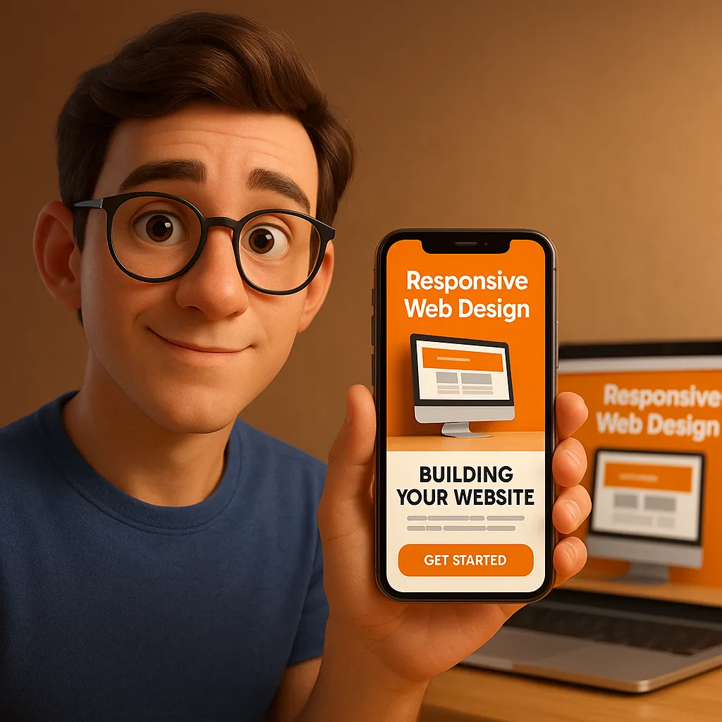
Mobile-first design means your site is built from the phone up — not just “made responsive” after the fact.
That means:
Clear, simple navigation
Fast loading times
No pinching, zooming, or clunky forms
And it’s not just about looks.
It’s about how users feel using your site.
Good Design = More Sales
People judge your business in seconds.
If your site feels dated or hard to use, trust drops immediately — and so do conversions.
Whether you sell products, book appointments, or generate leads…
Your mobile site is either making you money or costing you sales.
Here’s the Fix
You don’t need to rebuild your entire brand overnight.
But you do need a website that:
✅ Loads in under 3 seconds
✅ Shows the right content, in the right order
✅ Looks and works great on every screen
That’s what we do at Manic Marketing.
We build clean, fast, conversion-driven websites that start with mobile and scale beautifully to desktop.
No bloat. No fluff. Just a site that works.
Want Help?
We’ll show you what’s working — and what’s hurting your conversions — in a quick, free strategy call.
Book here: https://manicmarketing.com/strategy-session
And when you do, you’ll also get access to our free AI Content Marketing Tool — it connects to your social media and auto-posts across up to 8 platforms.
Because your website shouldn’t be the bottleneck.
It should be your most powerful sales tool.
